Making Book Organization Experience enjoyable and simple
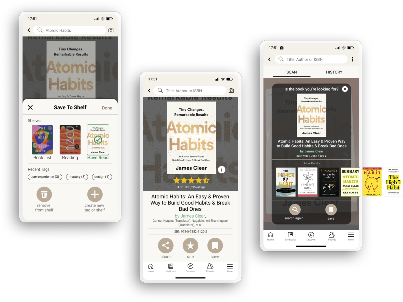
Revamp the book organization experience of Goodreads, which can seamlessly sort, categorize, and track the reading progress for book lovers
Goodreads is primarily a book review and recommendations platform, which users can search, rate, and review books on it. Readers can connect with friends to see what books your connections are reading, reviewing, and recommending. However, the current version has an outdated style and is user unfriendly, exists great usability issues. Hence, the purpose of this project is to improve the user experience and redesign the user interface of the Goodreads application.
Result
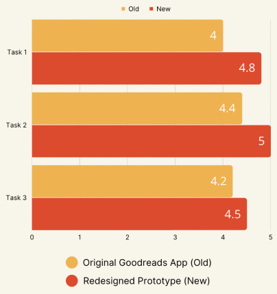
26% of the intuitiveness rate has increased compared to the previous version
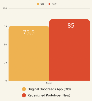
85 SUS score evaluated based on its updated features and functions
100% positive feedback provided by end users
Role
UX Designer
Research: User interview, Usability testing
Design: Ideation, Sketching, Wireframing, Prototyping
Team
Group Project
1 PM
1 UX Researcher
1 UX Designer
Tool
Figma
Miro
Procreate
Duration
10 weeks
Key Features
Fast onboarding
Smooth onboarding flow makes users create accounts efficiently
Intuitive book shelving system
Make your books organized and easy to browse
Instant scanning results
Easily connect the scanning results to your book organization
Background
Why this project?
Goodreads is dying because of its outdated style, user-unfriendly, and usability issues
As a book lover, I used to love using Goodreads. It was my go-to platform for searching for books, reading reviews, and keeping track of my reading habits. However, not anymore.
Goodreads was reported that users are frustrated with the lack of updates and changes to its functionality. Despite the passage of time, the website has remained largely unchanged with its basic functions. As a result, some users are exploring other platforms as alternatives to Goodreads.
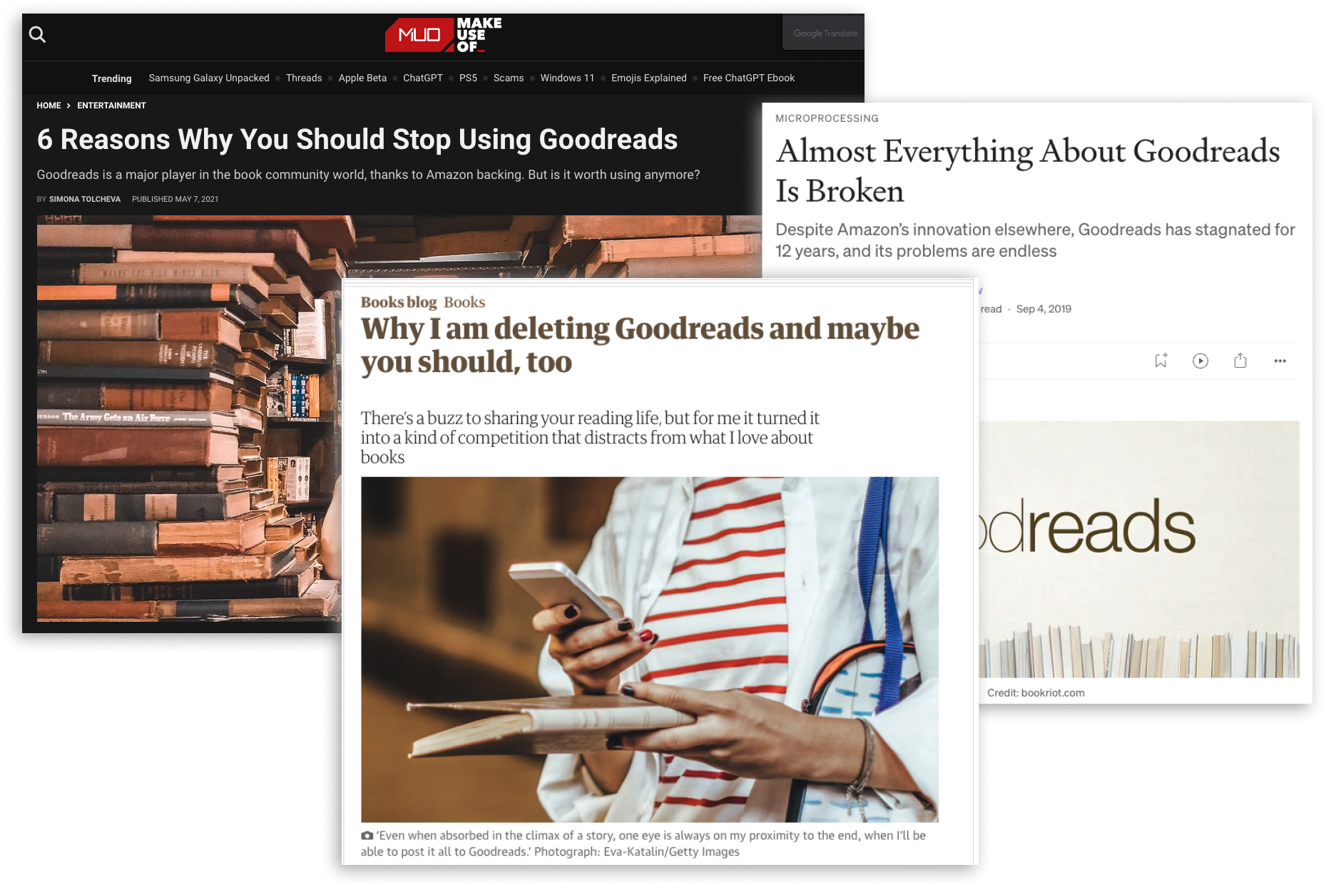
Source: Make Use Of, The Guardian, Medium
How to do?
✨ How might we define the user pain points and leverage limited resources to ship meaningful solutions for Goodreads users
The object of this project also focuses on the sub-questions:
- How might we prioritize the critical usability issues among the user pain points?
- How might we identify the most user needs for the target user group?
- How might we measure the success of the improvements?
Discover
Dive deeper into where to start
Conduct usability evaluations using heuristic analysis and user testing with five end users
I conducted two remote interviews with readers who were actively engaged and shared their feedback with my team
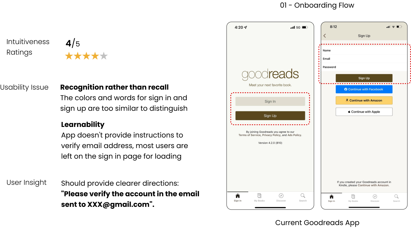
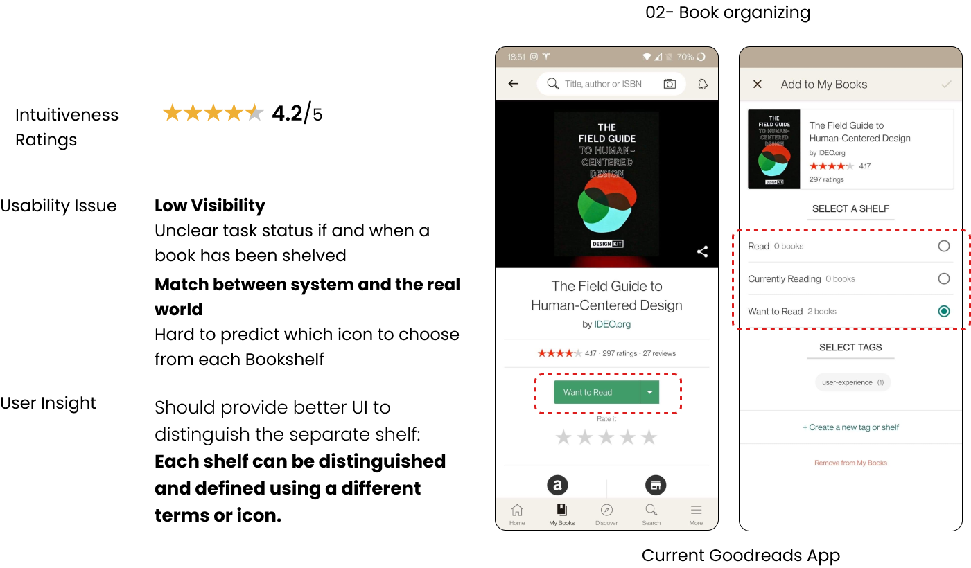
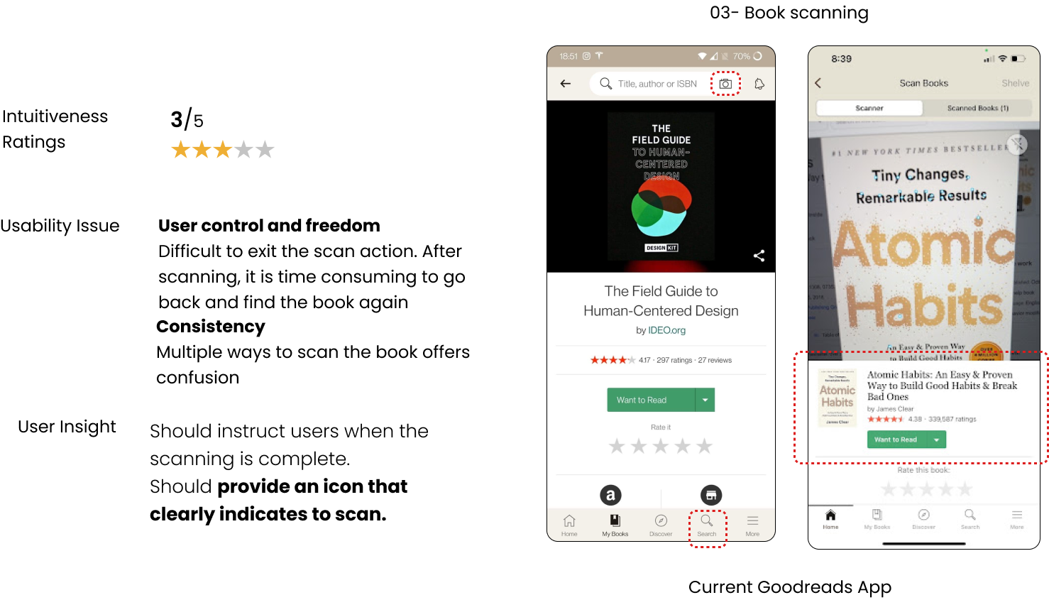
Key Insights
- Onboarding flow takes time and users don’t know where to go after submitting the account registration
- Book shelving section makes users confused and difficult to find or organize books
- Multiple ways to scan the book offer confusion and are time-consuming
Define
Based on the user feedback...
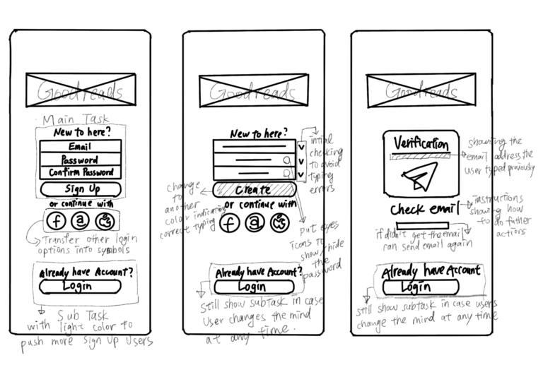
💭 How might we make the onboarding flow smooth and easy to navigate
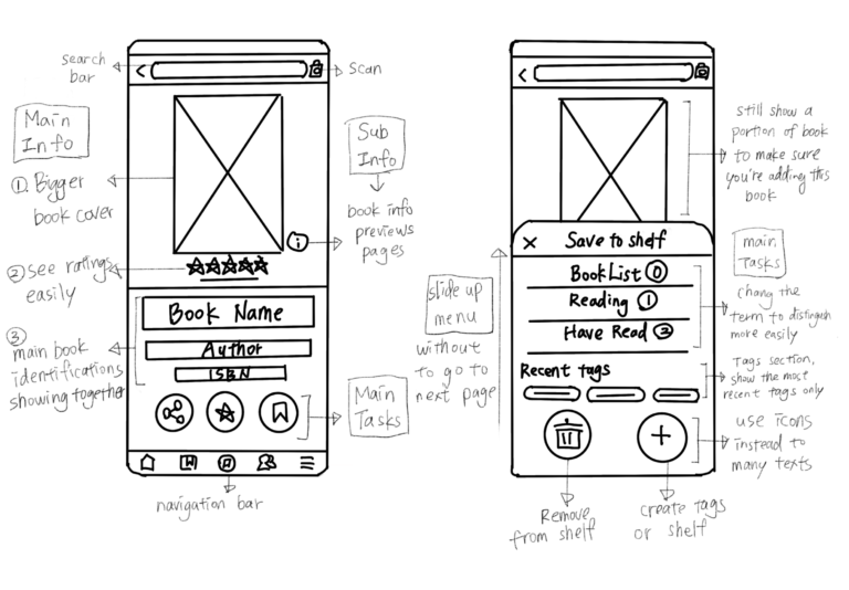
💭 How might we make the book shelving system more organized and easy to access
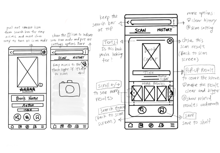
💭 How might we make the scanning feature more efficient and connect with the book shelving system seamlessly
Concreted users' motivation and frustration
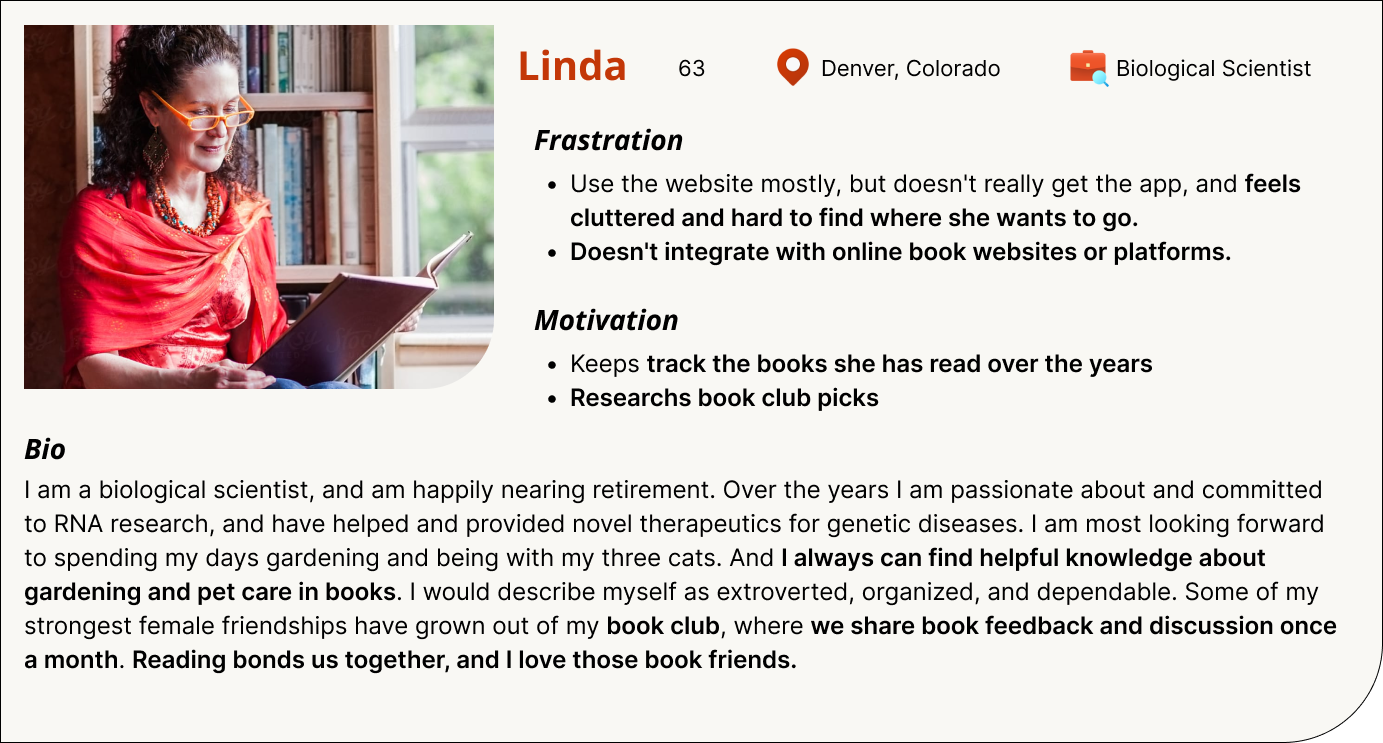
Two user personas were developed to help conceptualize the user expectations
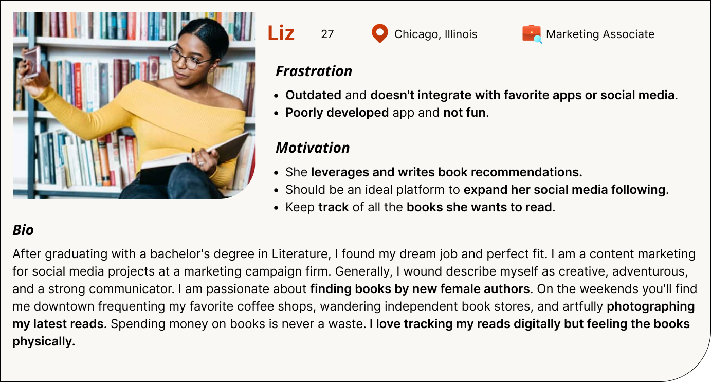
Average Millennial Reader
- Finding New Friends or followers.
- Looking for exploring new or popular contents.
- Tracking the books she is interested.
Average Elder Reader
- Connecting with existing friends
- Looking for books in a specific area Tracking the books she is reading and has read.
Develop
Wireframing solutions
Sketched out the solutions and communicated my design rationale with team
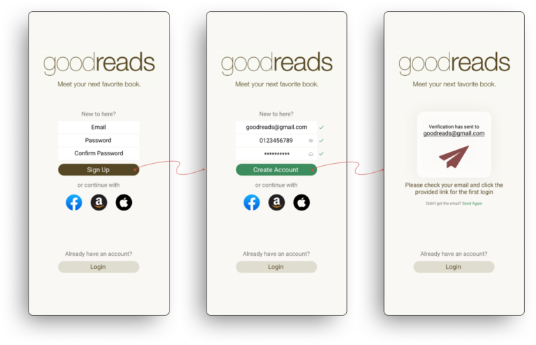
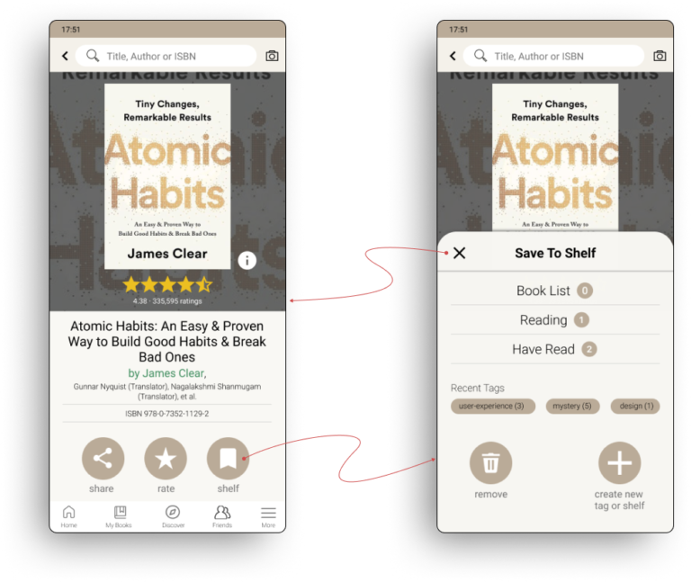
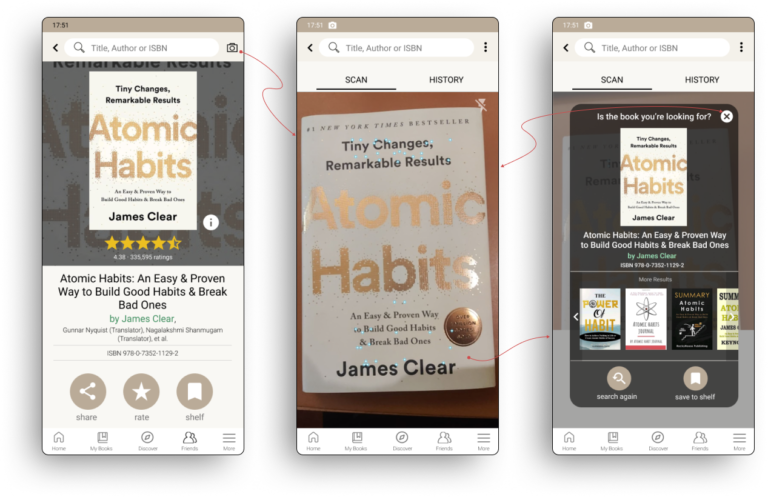
After finalizing the research and definitions, I utilized my wireframes to communicate my design rationales to my team. I sketched out the wireframe and reorganized the task flows by creating three conceptual designs accordingly to the three task flows that have usability issues.
Hi-fi prototyping
Redesigned the task flows and created the first version of the prototype
After finalizing the research and definitions, I utilized my wireframes to communicate my design rationales to my team. I sketched out the wireframe and reorganized the task flows by creating three conceptual designs accordingly to the three task flows that have usability issues.
Evaluate
Let's test it out...
Evaluated prototype v1.0 with five end users and made the improvements
After finalizing the first version of the prototype, I move forward to the usability evaluation to validate the design. I conducted one evaluation each to generate the result, which also can minimize the bias while participants are testing the original app and new design.
In this evaluation, I decided to use within-subjects, which require fewer participants. The participants were assigned the order of the old design and new design randomly, this led to minimizing transfer and learning across conditions.
Enhancements
What Users Did
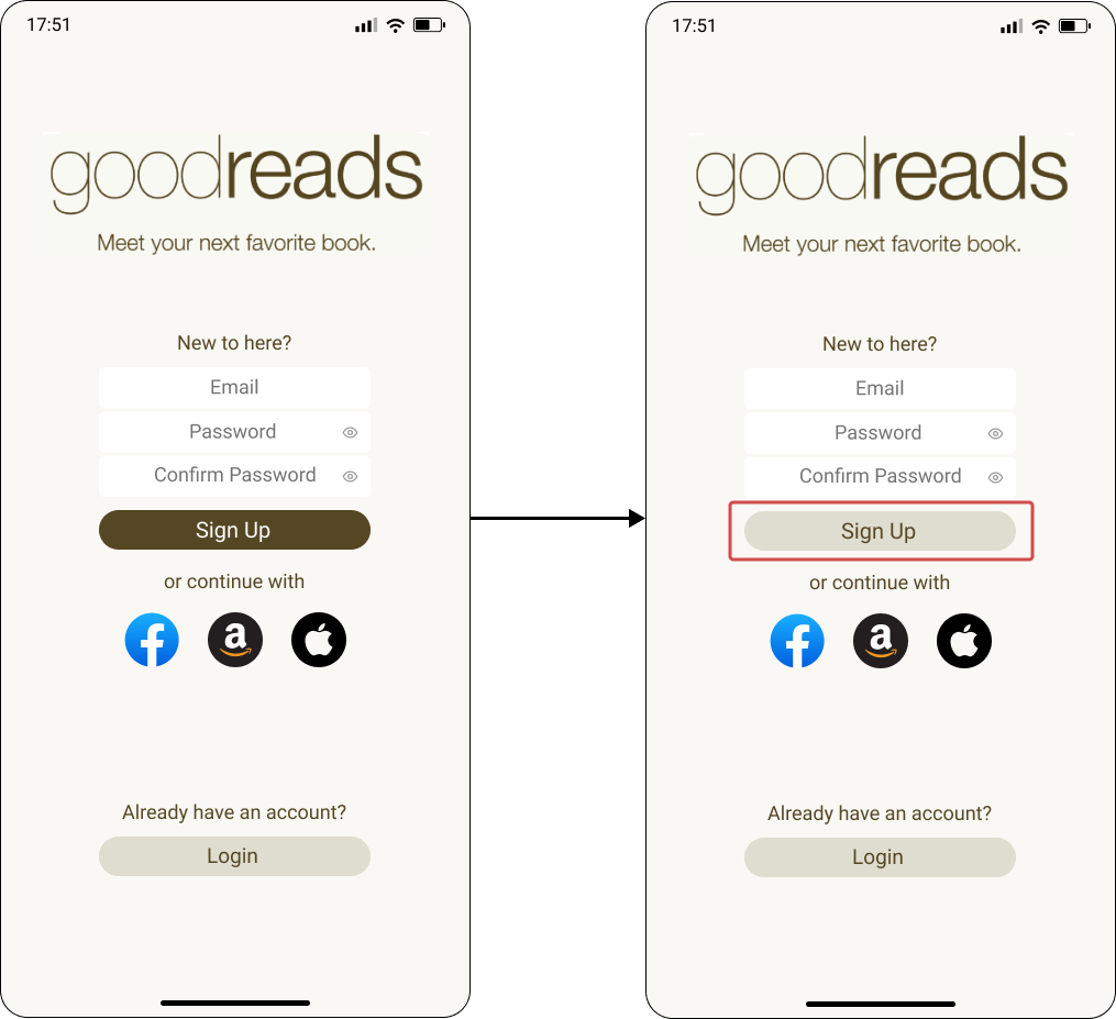
- Pressed “Sign Up” before filling out the text fields.
- Did not read the supporting text on the page.
What Users Said
- “Oh…I thought I had to press the ‘Sign Up’ button first to start the sign up”
Enhance Direction
Make the “Sign Up” Button look inactive until the above text fields have been filled out appropriately
What Users Did
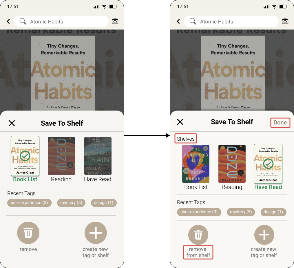
- Did not immediately recognize shelves as their previously created shelves.
- Stayed on the page waiting for confirmation that the book had been shelved or further instructions to shelve.
What Users Said
- “Am I done? I don’t know if I’m done…”.
- “I’d expect some kind of confirmation letting me know I’m done”.
Enhance Direction
- Clearly communicate these are the user’s shelves with labeling.
- Provide clearer feedback that the book has indeed been saved to the user’s shelf, and thus they’ve completed their intended task.
Final Design
After tons of tweaks...
Facilitated an efficient onboarding process and seamlessly connected the book organization system.
Fast onboarding
Smooth onboarding flow makes users create accounts efficiently
Intuitive book shelving system
Make your books organized and easy to browse
Instant scanning results
Easily connect the scanning results to your book organization
Reflection
What I learnt
Users might act in a different way
Evaluating design through user testing is really important because every designer has biases or something didn’t notice while designing. It is crucial to evaluate design through user testing as designers may have biases or overlook certain aspects of the design. For example, I may not have realized the significance of the “done” button for users in indicating task completion.
The power of text in functionality
Icons and animations could make the design energetic and more appealing, however, users prioritize efficiency and enjoyment in completing their tasks. To achieve this, concise and clear text can guide users through the process quickly and effectively.
