Mandy
A voice-enabled feature designed to seamlessly bridge reservation booking and navigation rerouting while driving
Overview
Mandy is a Voice Assistant system, which can bridge the barrier between making a restaurant reservation and adding a new stop in an existing route on the navigation to ease the frustrations of using the voice assistant while driving.
This Project was focused on how to reduce the visual and cognitive distractions drivers are exposed to because of cell phone usage.
By understanding and emphasizing in-depth the users, I created the features that the drivers most desire and need to tackle the issues of usage in voice assistants while driving further. Thus, users can take control of the wheel safely and keep the functionality of the voice assistants while driving.
Role
UX Research
Conversation Design
UI Design
Usability Testing
Tool
Figma
Miro
Procreate
Duration
6 weeks
Sep 2021 – Dec 2021
Responsibility
Mandy was a school project, my team and I discussed the research part together and interviewed users to create and analyze the interview data. After delivering the school project, I had a new perspective. Then, I kept the interview data and redeveloped all the following processes, and redesigned corresponding features and functions. Therefore, I created affinity mapping, user scenarios, persona, user journey map, and prototyping process. In this project, my responsibilities were UX research and UXUI design.
Challenge
“Using electronic devices while driving is a serious safety problem”
According to the National Highway Traffic Safety Administration, there are about 660,000 drivers using cell phones or manipulating electronic devices while driving at any given daylight moment. People easily get distracted and those things can divert your attention from driving, such as texting, messaging, adjusting the music, and setting your navigation on your smartphone. Since texting combines visual, manual, and cognitive distraction, which is considered the most dangerous type of distracted driving.
Empathize
Research
Identifying users’ pain points and finding out the most desired essential features of VA users needed.
User Interview
I interviewed 8 participants who have actively driving experience and often used Voice Assistants while driving. The participants were selected through a screener survey, which along with standard demographic questions included questions to let the participants state the scenarios in which they use their phones while driving as well as the difficulties experienced while using voice assistants.
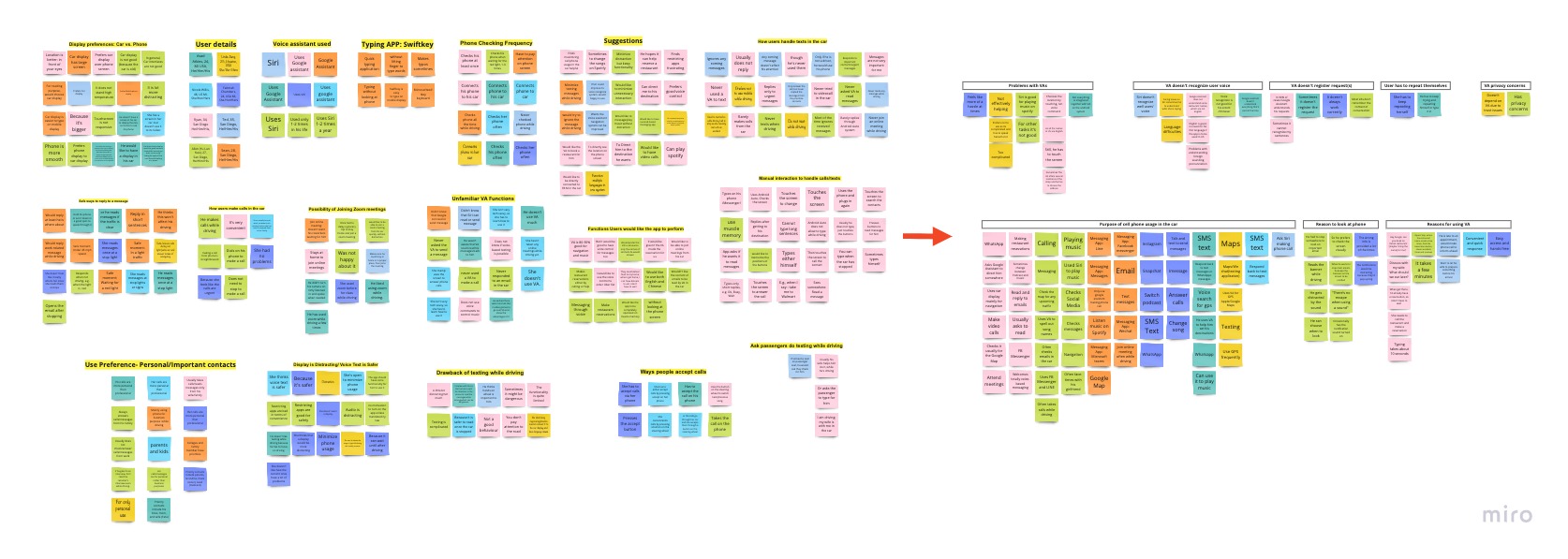
Affinity mapping
Pain Points
- VA doesn’t recognize the user’s voice
- VA doesn’t register requests
- Users have to repeat themselves
Insights
- Stay Connected with the car system to see the content from the bigger screen on the vehicle
- Have Full Access to the functionality of the phone
- Safety with easy access to VA and hands-free phones
Use Scenarios
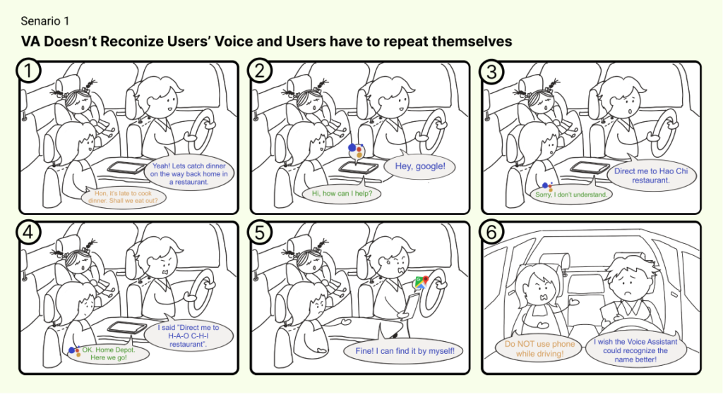
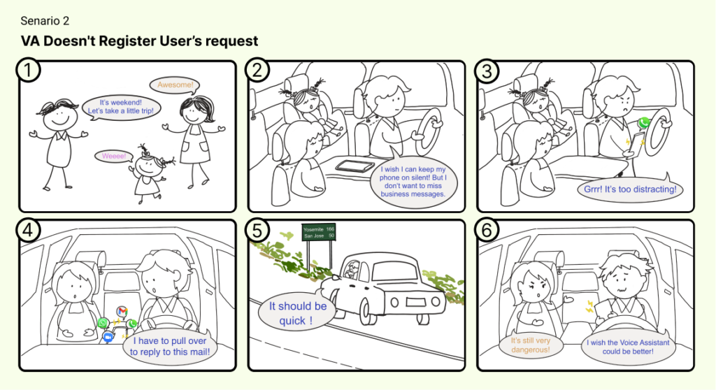
After the user interviews, users provided a lot of feedback and explained the situations they encountered while using the VA. In order to understand their pain points in-depth. I crafted out the scenarios in Procreate app that users mentioned in the interview to build up the scenarios and use cases to help us brainstorm and create the solutions in the design phase.
Ryan wants to enable VA for searching a certain restaurant for him on his way home, but VA doesn’t get the task done smoothly. Also, VA doesn’t provide any instructions for the next step and stays on a certain stage, which sometimes just blocks the screen for navigation, isn’t helpful, and makes users anxious.
What makes users keep complaining...
- While a user is on a route, VA can’t help the user do another task smoothly.
- Enabling VA to search a location is fine, however, VA isn’t able to integrate other functions together.
- Users have to repeat themselves
Define
User Persona
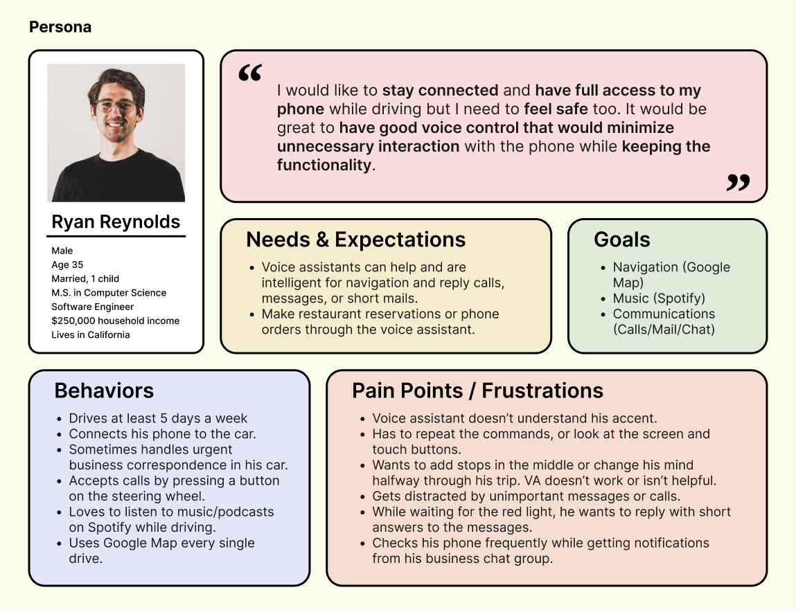
After gathered a bunch of knowledge of the audience, as well as their goals and needs, I use the user persona to represent key audience segments. It helps me focus on tackling the most important problems – To address the major needs of the most important user groups.
Let’s meet Ryan, a Software Engineer in California. He drives almost every day, usually connects his phone to the car system, and uses voice assistant to help him with some tasks while driving.
User Journey Map
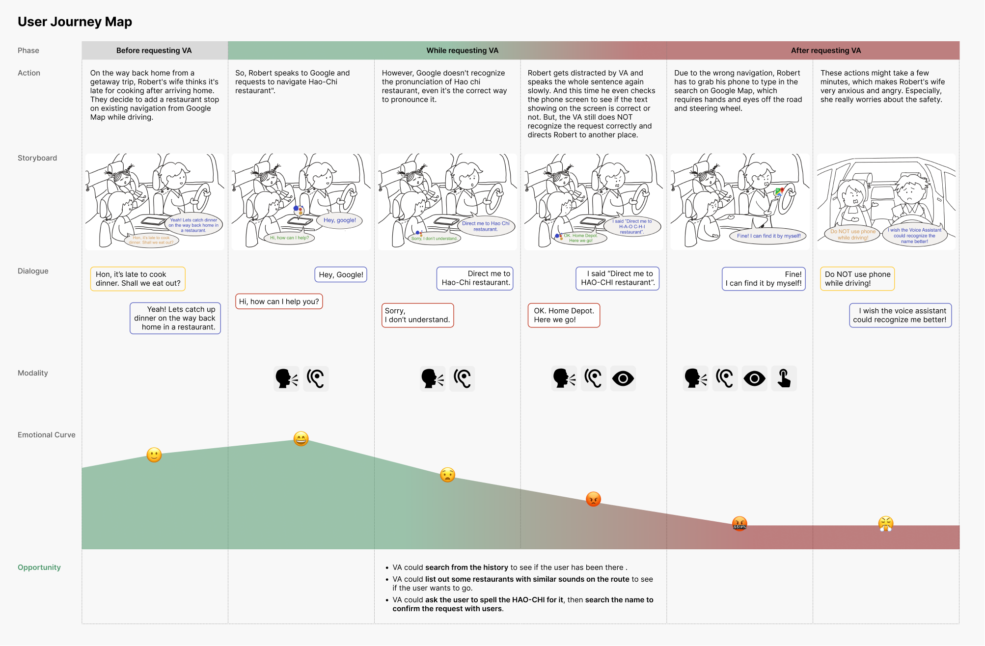
From the persona, I put myself into Ryan’s shoes and imagined how Ryan would encounter the experience with the Voice assistant while driving. I used the user journey map to illustrate the situation and analyze each phase of requesting the voice assistant. And I divided it into three stages, the first s before requesting VA while requesting VA, and after requesting Va with 6 scenario images and their dialogue. You can easily tell from the user journey map, Ryan experienced difficulties while requesting VA, and VA has a major problem, which is when Ryan requests to search for a restaurant, he attempts to reach out to this restaurant and make a reservation.
However, VA has limitations and just stays on s certain stage, and doesn’t provide users any instruction for the next step. This makes users confused and they have to pull over or grab the phone to do the tasks.
Key takeaways
- VA could search from the history to see if the user has been there .
- VA could list out some restaurants with similar sounds on the route to see if the user wants to go.
- VA could ask the user to spell the HAO-CHI for it, then search the name to confirm the request with the user.
Ideate
Task Flow
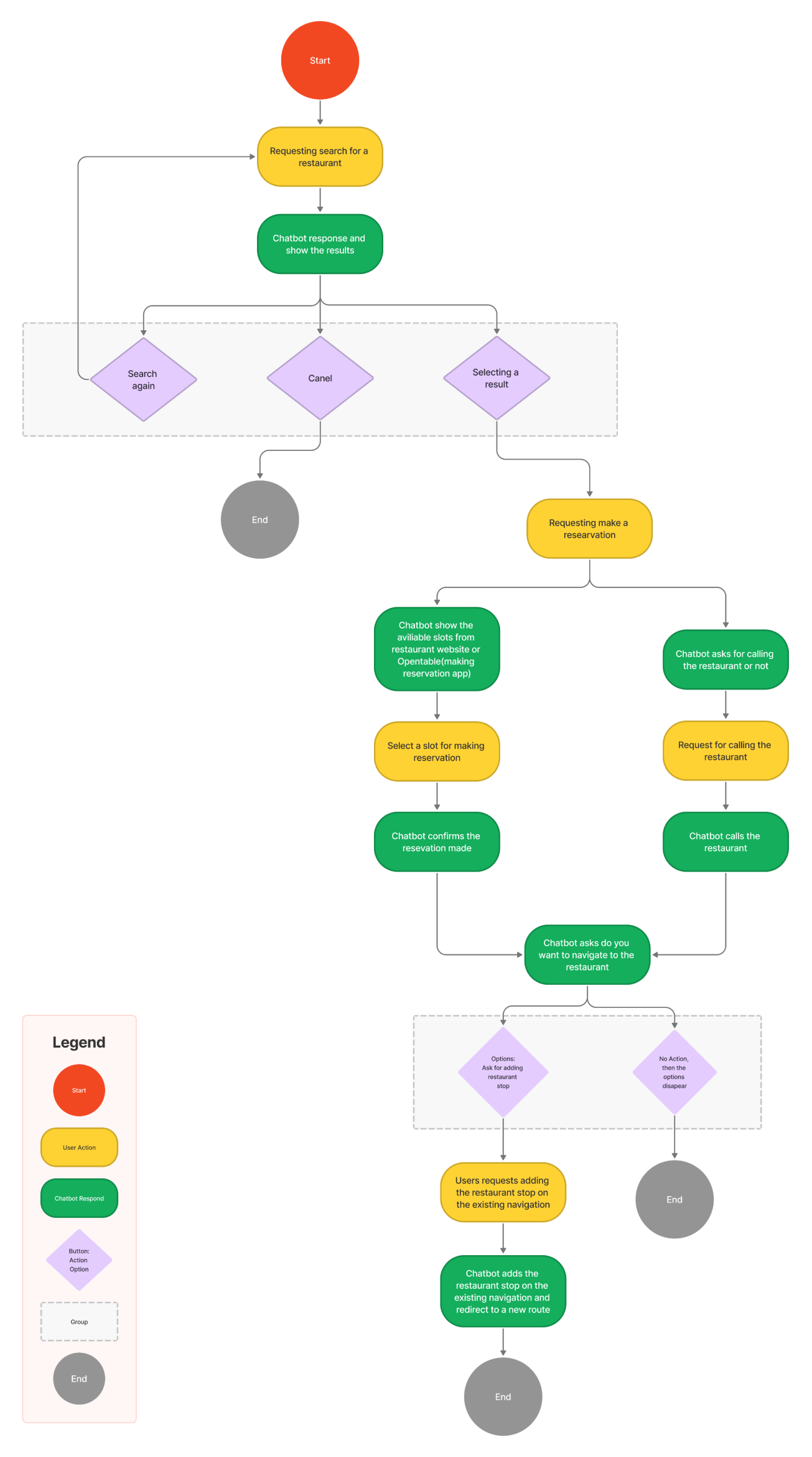
After identifying the pain points, I used the task flow to build out the architecture and frame the process which presents how users interact with the voice assistant.The flow showed that there are three branches showing the users could end the task at three points and giving users the options in which they can decide where users want to go.
Conversation Design
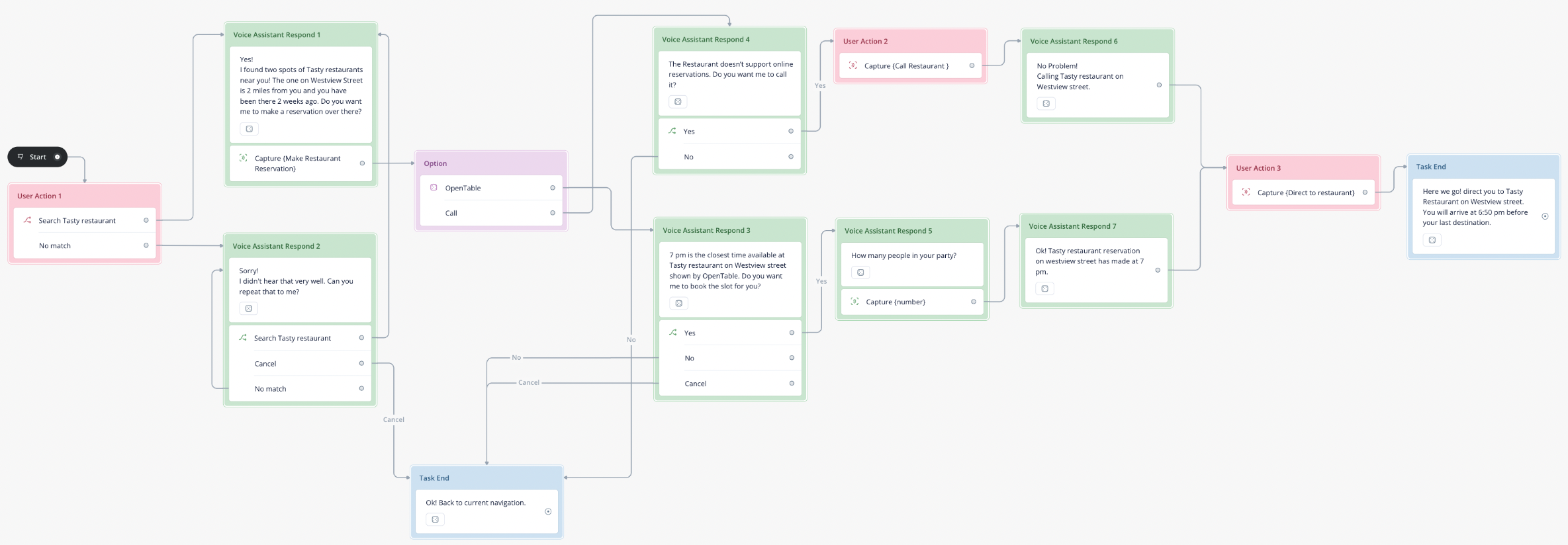
Moving on to the conversation design, I followed the design guildline by Google Assistant and utilized the online tool, Voiceflow, to help me scheme the system process. I can test out whether the dialogue flow makes sense or not before I craft the wireframe. This step is really important because I can see how the conversation flow could be implemented and how intuitive it is for humans. And I provided the prototype link below for reference.
Design Rationale
Focus on the user
Make the user the center of attention. User-focused text keeps the conversation on track. It’s more crisp and to-the-point.
Don't launch into monologues
Be informative, but keep responses concise. Let users take their turn. Don’t go into heavy-handed details unless the user will clearly benefit from it.
Use short, simple words
Plain and simple language has the broadest appeal, making it accessible to people of all backgrounds.
Avoid jargon and legalese
Be mindful of the terminology, and watch for specialized expressions that can elicit misunderstanding and mistrust. Types of content that are especially prone to jargon include: sign-up flows, error messages, and descriptions of settings.
Lead with benefits
If you want the user to do something, give them a reason first. Follow this formula: “To get what you want, do this thing.”
Avoid niceties
Niceties make responses feel distant and formal. Ditch them to keep the conversation friendly and informal.
Use contractions
Spelling out words like “cannot” and “do not” can sound punishing and harsh.
Don't provide UI-specific directions
Refer to actions and concepts instead. This keeps the information fresh and accurate even as the interaction design evolves.
Prototype
LoFi Prototype
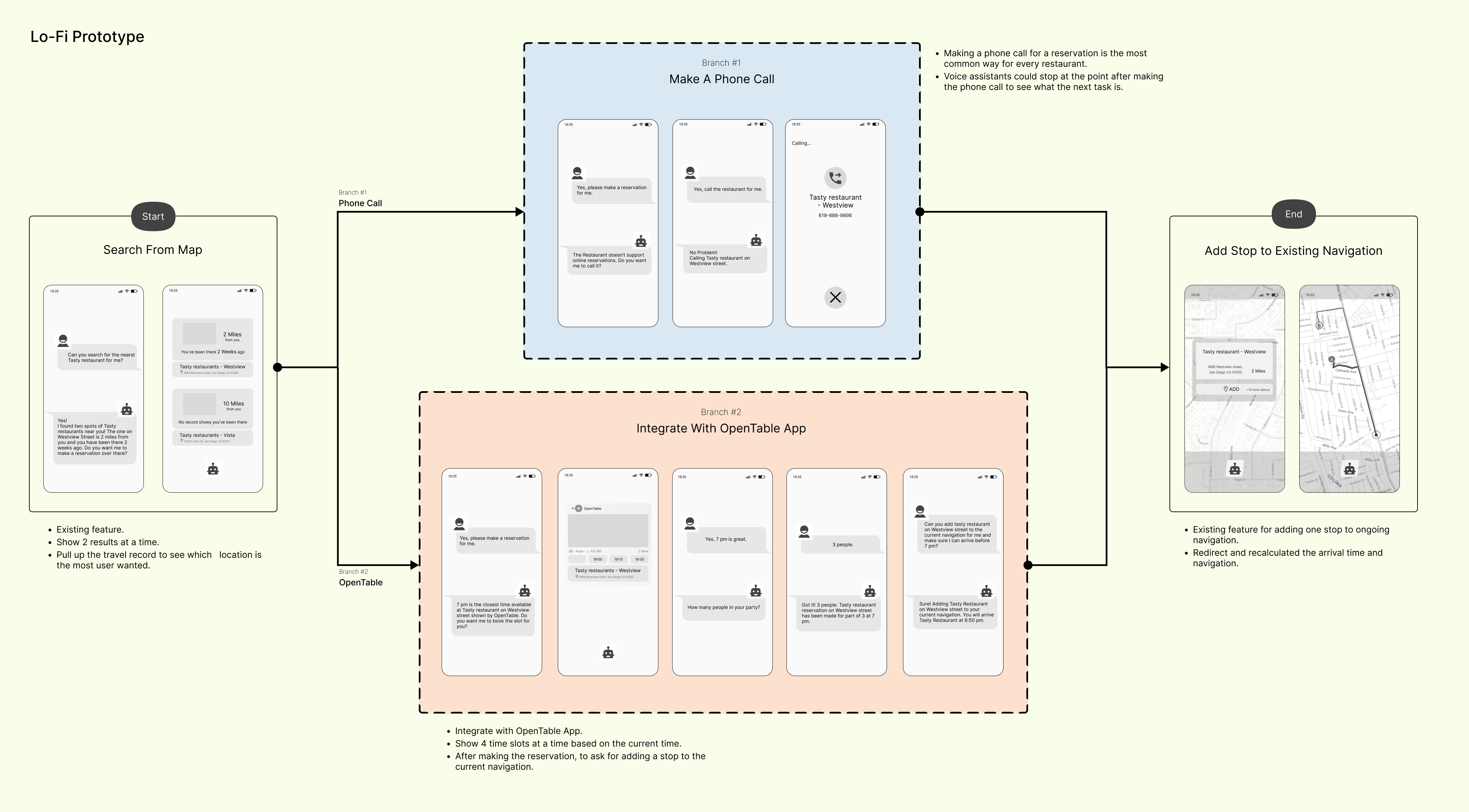
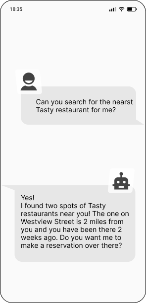
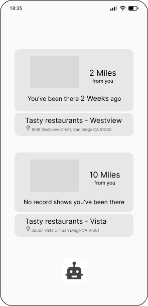
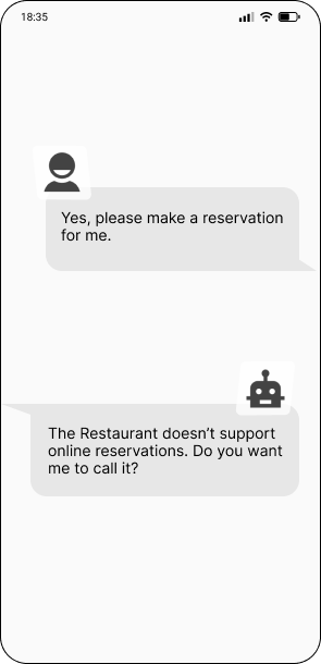
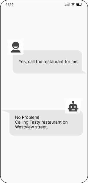
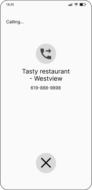
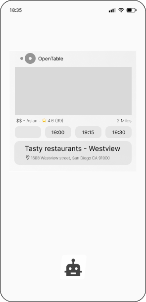
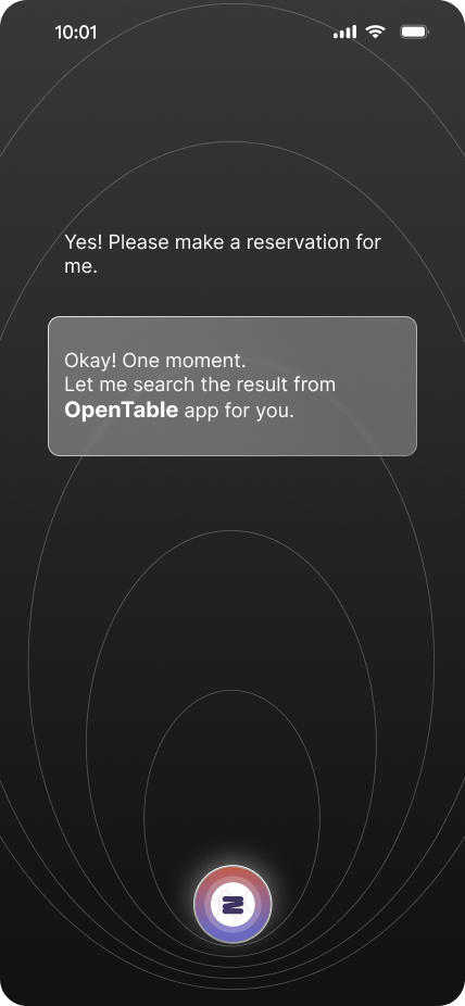
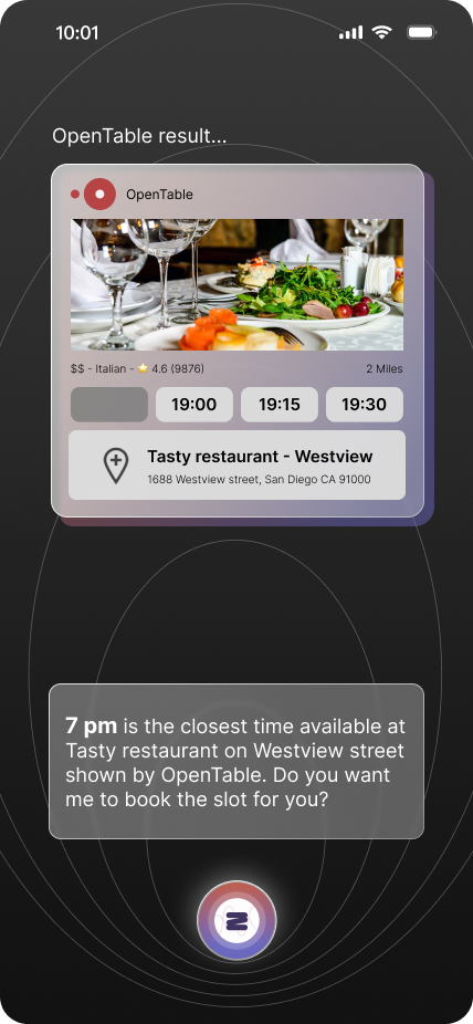
After creating the dialogue flow, I started thinking about how the visual components could convey each stage that the voice assistant interacts. I made two branches, one is for the phone call flow, and the other one is for the integration with OpenTable App. For the phone call, it is rather easy for the conversation and the user input would be straightforward. For the OpenTable flow, my thought would be to show actions and results on the screen and let users can check what actions are going to ease the uncertainty and build trust with users.
Design System
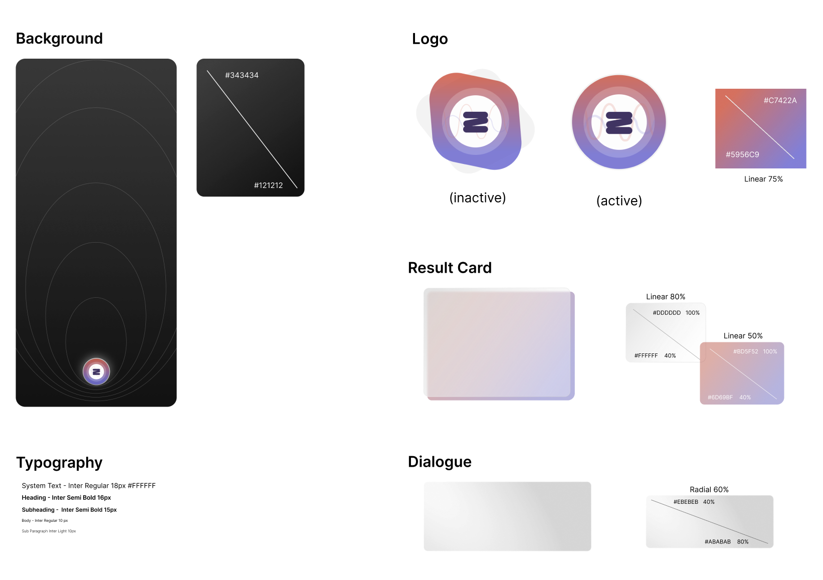
Regarding it would be a conversation format, I decided that leave space for showing the dialogue and the result cards and tried to avoid any redundant distractions to keep drivers safe. The color palette was chosen following the design guidelines for Google Assistant. Considering drivers would have some glare reflectings on the phone screen. I choose the gradient dark color and set it to dark mode.
Final Prototype
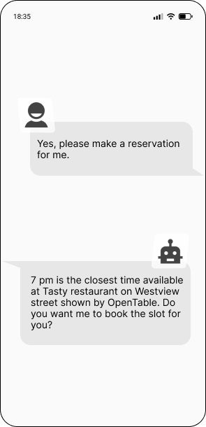
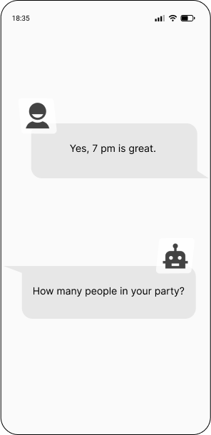
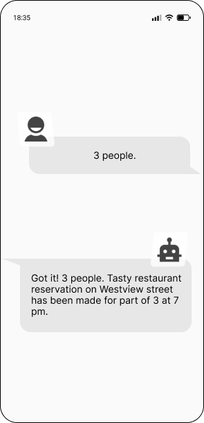
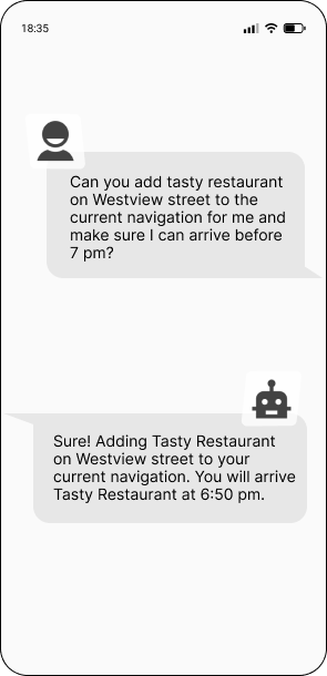
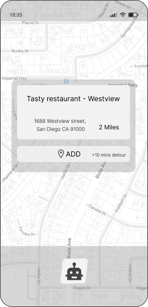
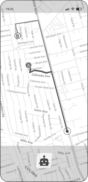
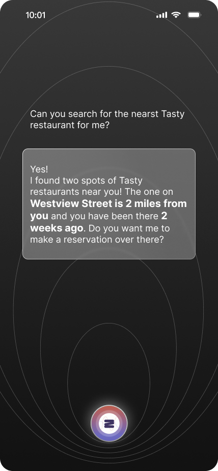
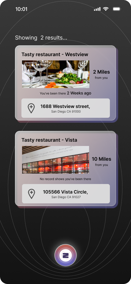
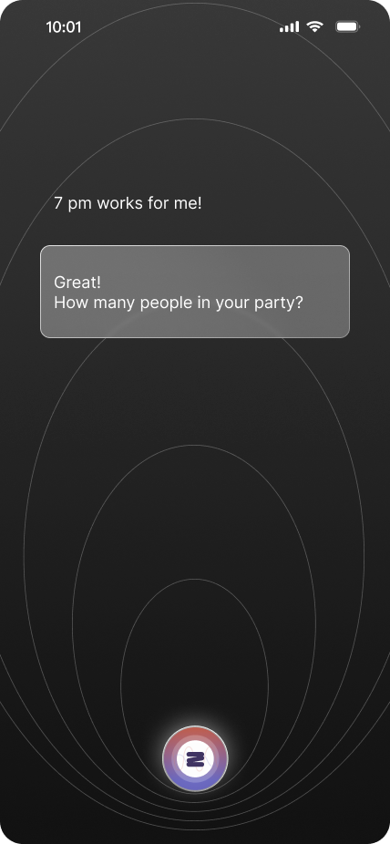
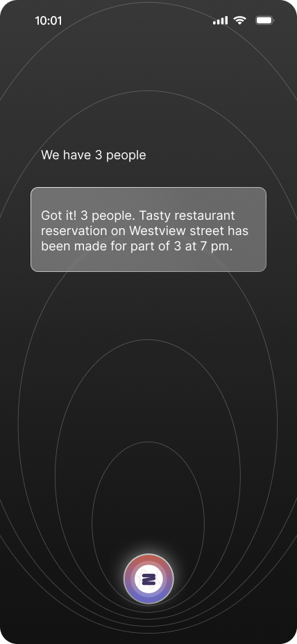
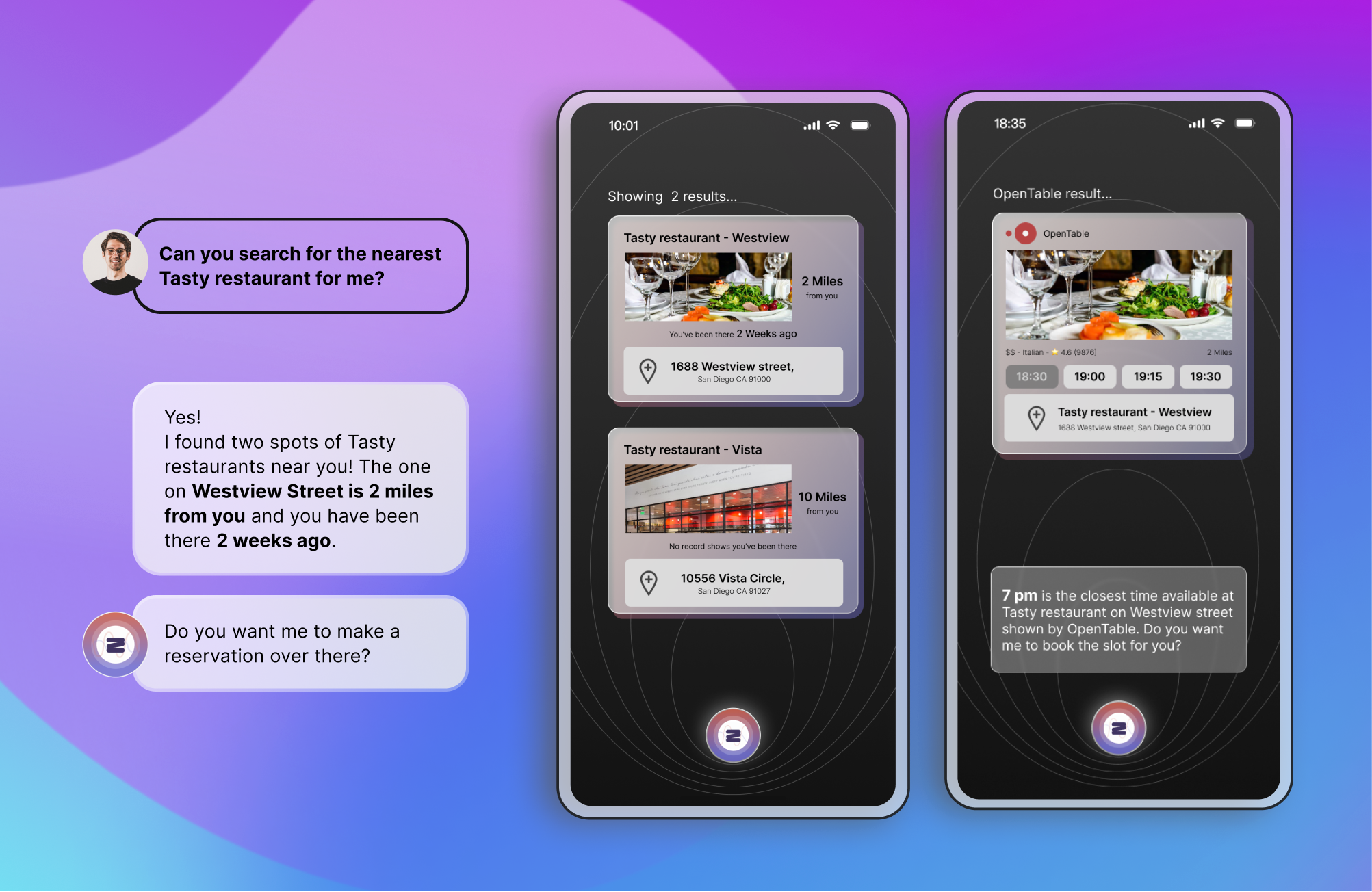
After iteration, the low-fidelity prototype was converted into a high-fidelity design. I designed both the visuals for the user interface and conversations for searching the nearest restaurants and making restaurant reservations either by a phone call flow or by pulling out the information from OpenTable to seamlessly assist users to complete the tasks they desired.
Evaluation
User Testing
Once the high-fidelity prototype was complete, 5 users from the target audience were invited to do the user testing. Prior to the usability tests, I designed a usability testing questionnaire and scenarios for testing the designed tasks of requesting to search a specific restaurant, then booking a restaurant reservation through the voice assistant while driving.
The ideal setting for testing the app would have been asking the users to interact with it while driving. However, such contextual inquiry type of testing was not able to complete due to safety constraints and the prototype was designed to be embedded in an existing voice assistant as a supporting feature. So the usability testing was conducted through in-person interviews and observing the users see how they would interact with the prototype. The obtained feedback generated valuable insights for iteration.
Reflection
What did I Learn + Next Step
Did the solution address the problem?
With the final prototype created, I believe we have met the goals that were outlined at the beginning of the design process. The features of the voice assistant I created in Mandy, can help the users complete the restaurant search, reservation making, and add a new stop which users just search for to existing navigation seamlessly without pulling out the cable or jumping to another app back and forth. Mandy provides not only cutting-edge features but also the users’ most desired features in voice assistant. In this project, I concluded the problems through human-centered design strategy to finalize the best solution for users, which can meet users’ needs and break the barriers of the current system of voice assistants.
Next Step
If I had more time, I would like to know more about how the voice assistant work from the back end. Since when I used VoiceFlow to help me build out the dialogue, I noticed that when you design the code, you have to use the bot-centered concept to navigate the flow. This means that you have to think about what the bot is listening to, what keywords the bot can catch, not what words talking by humans. It is a great experience that I ever had that learn from this project and dive into the AI world.
